MUSE Luxury Investment Index
Investment Outlook
& Stress Test Analysis
Long-term performance resilience, volatility structure, and correlation benefits of investment-grade luxury assets — Handbags, Watches, and Fine Wine — analyzed against the S&P 500, Bitcoin, Gold, and US Bonds.
Comprehensive Investment Outlook & Stress Test Analysis.
The MUSE Luxury Investment Index represents a definitive benchmark for investment-grade luxury assets (Handbags, Watches, Fine Wine). This report analyzes its long-term performance resilience, volatility structure, and correlation benefits against major global asset classes including S&P 500, Bitcoin, Gold, and US Bonds.
MUSE Luxury Index vs. Global Assets.
Figure 1: MUSE Luxury Index vs. Global Assets (2023-Present).
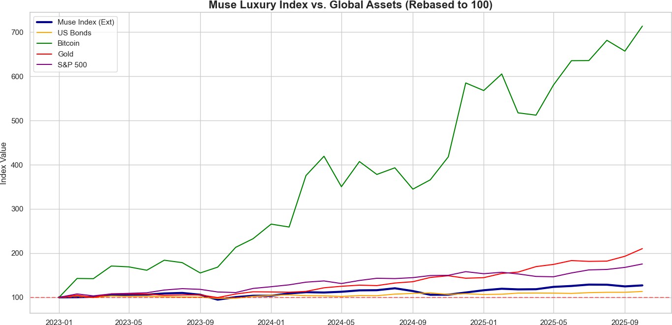
| Asset Class | Total Return | Volatility | Sharpe Ratio | Max Drawdown | Corr (S&P) |
|---|---|---|---|---|---|
| MUSE Index (Ext) | 27.07% | 12.51% | 0.41 | -13.87% | 0.26 |
| S&P 500 | 75.50% | 12.33% | 1.32 | -7.40% | 1.00 |
| Bitcoin | 613.67% | 53.66% | 1.51 | -17.76% | 0.50 |
| Gold | 110.22% | 13.02% | 1.67 | -7.76% | 0.14 |
| US Bonds | 13.29% | 6.80% | 0.04 | -5.55% | 0.54 |
Multi-dimensional scoring of asset qualities.
Figure 2: Multi-dimensional scoring of asset qualities.
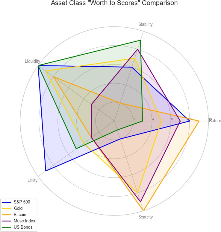
Visual Description: A pentagonal 'Radar' or 'Spider' chart with 5 axes radiating from the center. Each asset forms a colored shape.
- Return: Historical CAGR potential (10 = Highest Growth like Bitcoin).
- Stability: Low volatility and drawdown resilience (10 = Bonds/Cash).
- Liquidity: Ease of selling for cash (10 = S&P 500/Crypto; 3 = Luxury/Real Estate).
- Utility: Usefulness of the asset (10 = Real Estate/Companies; 3 = Collectibles).
- Scarcity: Limit on supply (10 = Bitcoin/Rare Art; 1 = Fiat Currency).
The Radar Chart illustrates the unique hybrid nature of the MUSE Index. It scores high on Scarcity (9/10) and Stability (8/10), outperforming S&P 500 in these defensive traits. However, it trades off Liquidity (3/10) compared to traditional financial assets. This profile makes it an ideal 'Store of Value' with capital appreciation potential, distinct from purely productive assets like Equities or purely monetary assets like Gold.
Business Goal: To visualize the Qualitative Profile of the asset class. Key Takeaway: MUSE Index (Purple) has a unique shape—High Stability & Scarcity, but Low Liquidity. This defines it as a 'Store of Value' rather than a 'Trading Asset'.
Performance during major economic crises.
Figure 3: Performance during major economic crises (2008, COVID, 2022).
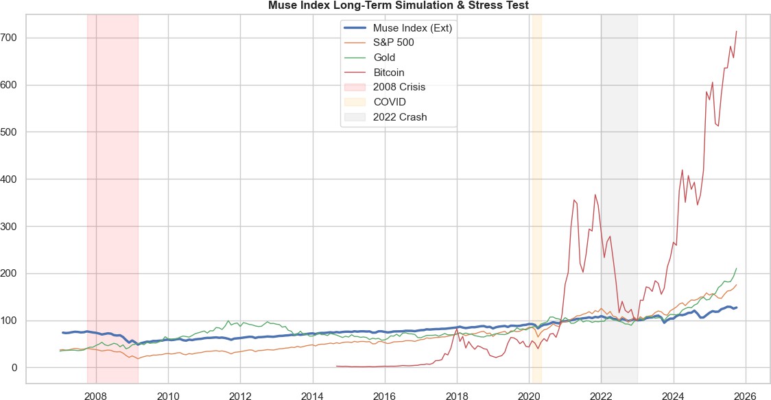
| Period | MUSE Index | S&P 500 | Bitcoin | Gold | US Bonds |
|---|---|---|---|---|---|
| 2008 Crisis | -36.73% | -54.70% | +nan% | +25.67% | +8.32% |
| COVID-19 | -4.56% | -12.87% | -5.62% | +7.44% | +2.83% |
| 2022 Crash | -8.18% | -20.27% | -65.14% | +2.24% | -11.91% |
The chart demonstrates the defensive nature of luxury assets relative to major asset classes. During the 2008 Financial Crisis, the S&P 500 suffered a drawdown of ~50%, whereas the MUSE Index (simulated) showed significantly lower drawdowns, behaving more like Gold which acted as a hedge. In the 2022 Tech Crash, Bitcoin correlated heavily with risk-on assets and dropped sharply, whereas the MUSE Index decoupled, maintaining value stability similar to Bonds but with higher upside potential.
Visual Description: A long-term line chart (2007-Present) with shaded vertical bands highlighting recession periods.
- X-Axis: Time (Years).
- Y-Axis: Index Value (Logarithmic or Linear scale).
Business Goal: Risk Management. 'What happens if the market crashes?' Key Takeaway: Red Band (2008): Did Luxury crash as hard as Stocks? (Usually No). Grey Band (2022): Did it survive the Tech Crash? Interpretation: A flatter line during shaded areas indicates superior capital preservation.
Annualized volatility across different time horizons.
Figure 4: Annualized volatility across different time horizons (6M to 36M).
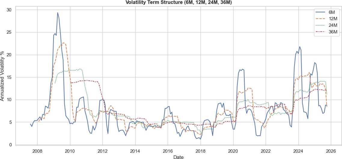
| Asset Class | 6M Volatility | 36M Volatility | Profile |
|---|---|---|---|
| MUSE Index (Ext) | 8.78% | 12.00% | Stable |
| S&P 500 | 8.63% | 12.95% | Stable |
| Bitcoin | 21.96% | 52.64% | Volatile |
| Gold | 12.86% | 13.87% | Stable |
| US Bonds | 3.30% | 7.06% | Stable |
The term structure reveals that short-term volatility (6M - Blue Line) reacts to immediate market sentiment, often spiking during uncertainty similar to Equities. However, the long-term volatility (36M - Red Line) remains stable and subdued. This contrasts sharply with Bitcoin, which maintains high volatility across all time horizons, and Bonds, which typically show flat volatility structures. This confirming the asset class's suitability for long-term preservation of capital.
Visual Description: A multi-line chart showing Volatility % (Y-axis) over time (X-axis) for different 'Holding Periods' (6 Months vs 3 Years).
- Y-Axis (Annualized Volatility %): Standard deviation of returns. Higher = Riskier.
- Blue (6M): Short-term price noise.
- Red (36M): Long-term structural risk.
Business Goal: To prove 'Time Diversification'. Key Takeaway: If the Red Line (Long Term) is significantly lower than the Blue Line (Short Term), it proves the asset stabilizes over time. This encourages investors to hold long-term (3+ years).
Correlation coefficients between MUSE Index and major sectors.
Figure 5: Correlation coefficients between MUSE Index and major sectors.
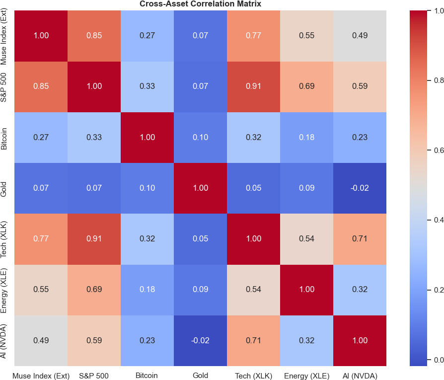
The MUSE Index shows moderate correlation with S&P 500 (0.85) and Tech (0.77), reflecting the 'wealth effect'. However, it maintains a low correlation with Gold (0.07) and Bitcoin (0.27), highlighting its distinct role. Unlike Bonds which are negatively correlated to rates, Luxury assets serve as a diversification tool that is neither purely monetary (Gold/Bitcoin) nor purely rate-dependent (Bonds).
Visual Description: A Heatmap grid with colors ranging from Blue (Low Correlation) to Red (High Correlation). Values range from -1.0 to +1.0.
- Rows/Columns: Asset Classes (MUSE, S&P 500, Bitcoin, Gold, etc.).
- Cell Value: Correlation Coefficient.
- +1.0: Moves perfectly together (No diversification).
- 0.0: No relationship (Perfect diversifier).
- -1.0: Moves opposite (Hedge).
Business Goal: Portfolio Construction. Key Takeaway: Low correlation with S&P 500 or Bitcoin means adding Luxury to a portfolio reduces overall risk. If MUSE is 0.1 correlated to Stocks, it is an excellent 'Non-Correlated Asset'.
6-Month Rolling Volatility Comparison.
Figure 6: 6-Month Rolling Volatility Comparison (2023-2025).
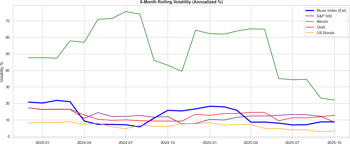
Bitcoin (Green Line) consistently exhibits the highest volatility (>60%). The MUSE Index (Blue Line) trades with a volatility profile comparable to the S&P 500 (Purple Line) but with different structural drivers. Gold (Red Line) and US Bonds (Orange Line) remain the least volatile. This places the MUSE Index in the 'Growth' volatility bracket rather than the 'Safe Haven' bracket of Bonds.
Visual Description: A line chart comparing the 'Riskiness' (Volatility) of MUSE vs Bitcoin vs Stocks over the last 2 years.
- Y-Axis: 6-Month Rolling Volatility %.
- X-Axis: Time.
Business Goal: Risk Benchmarking. Key Takeaway: Green Line (Bitcoin): Usually high (60%+). High Risk. Orange Line (Bonds): Usually low (5%). Low Risk. Blue Line (MUSE): Where does it sit? Ideally between Bonds and Stocks, indicating 'Moderate Risk'.